We like to believe the adage, “Don’t judge a book by its cover,” but we do it all the time. A bad cover hurts sales. A good cover makes sales. In fact, a recent novel, Nothing but Blackened Teeth, sold many copies on its amazing cover, but has gotten a lot of negative reviews for not living up to that alluring cover. It’s about aesthetics. Nice aesthetics draw people in.
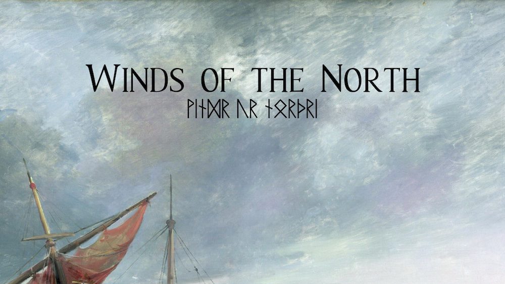
For Winds of the North, aesthetics are important, and I’ve made a number of changes to the aesthetics to improve the look and make the information clearer. The previous cover, while fine, was always temporary. It’s a bit minimalist, giving most of the space to the artwork. It’s a fine look for a cover, but it’s not very reflective of the setting. The first variation was to better organize the information and change the font to something more in-setting.

Cover 1 
Cover 2
Then there was a slight revamp after picking what would be the dimensions of the book, 7×10.

For fun, here’s a look I considered but decided against. I was shooting for a sort of early 80s throwback.

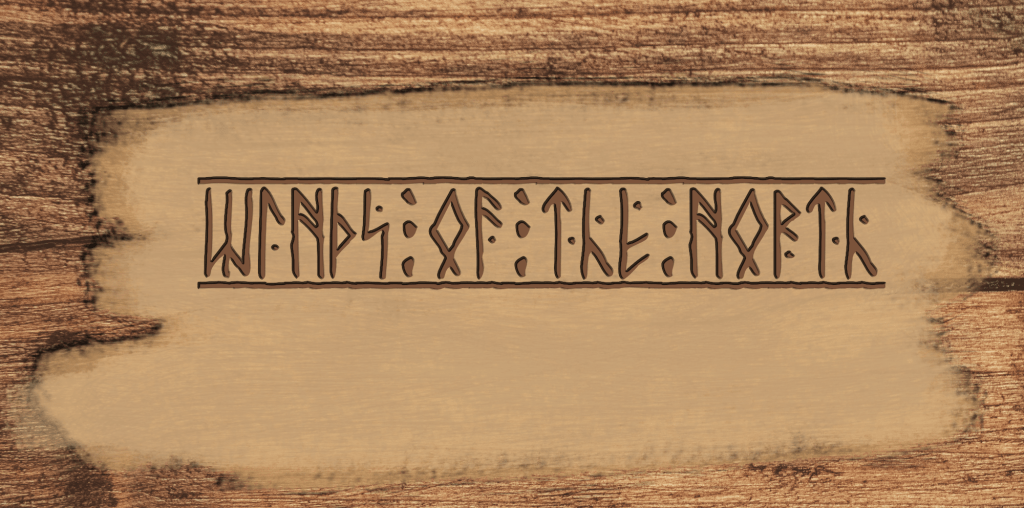
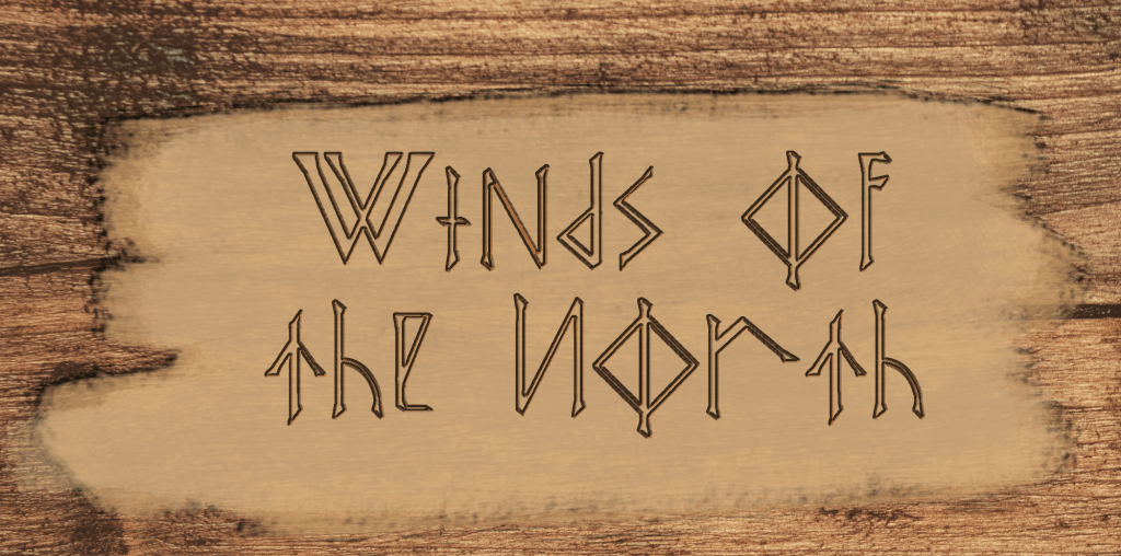
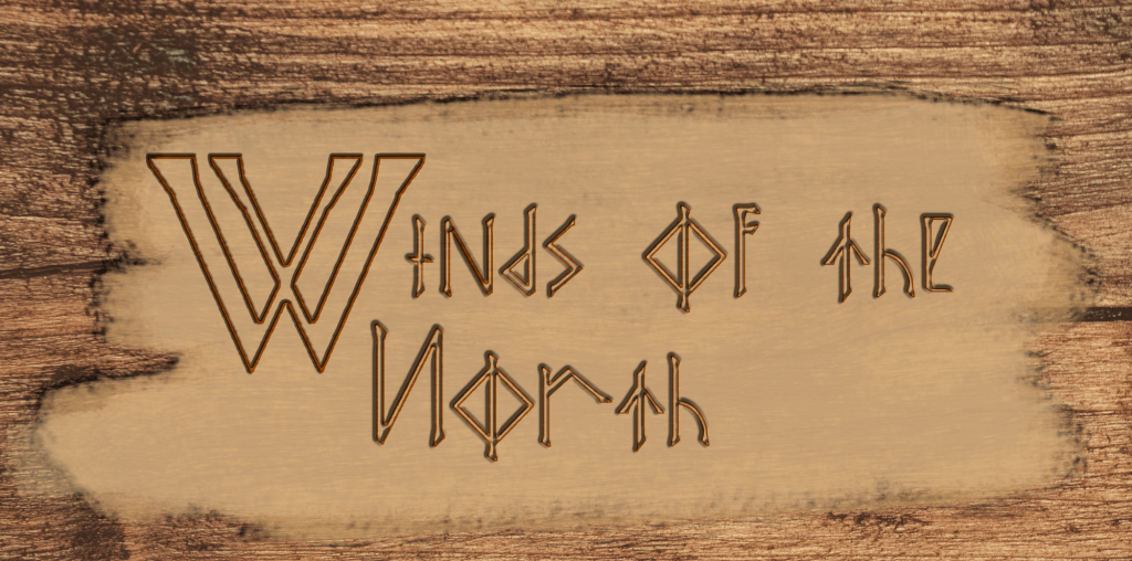
So when I started working on a proper cover, I wanted a logo, not just text. Here are a couple of rough ideas I played with at first. The idea behind them is that it would be a wood-carved look.
One of the challenges since the beginning was finding a font that looks appropriate to the setting that’s still readable. There were other problems finding runic fonts that use runes from the Viking Age rather than later runes or based on runic alphabets from something like Lord of the Rings or a video game.
The next idea I wanted to explore was replicating the look of the Icelandic Sagas. They have big flowery initial letters like you’ve seen in a lot of medieval manuscripts. And there are fonts that offer the same level of decoration, but I wasn’t finding one that was quite right. The other option was making it myself, which I dreaded. Many times, making something from scratch can end up with a very lackluster result that looks nothing like what you were going for.
It might not be final yet, but I’m pretty happy with how the new cover came out.


